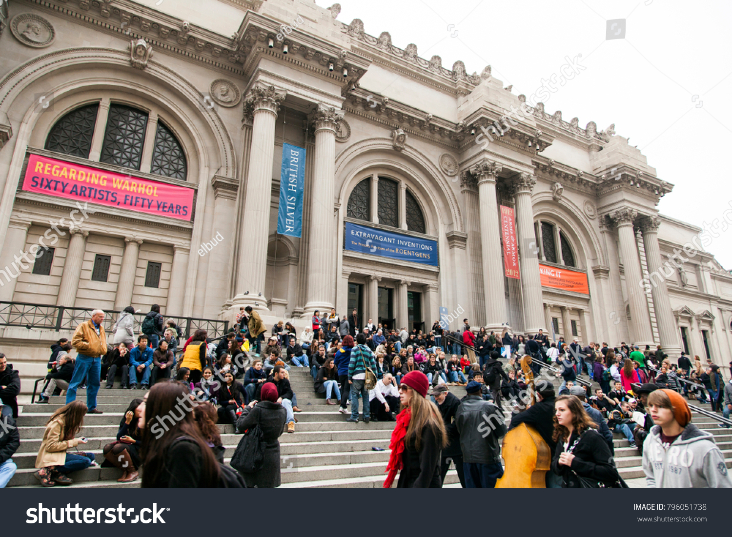
The MET – Shuttlestock Photo
Contrary to the exhibition’s own title of the word vertigo – which is the sensation of whirling and loss of balance often associated with being at high heights – the curation of the show at the Metropolitan Museum of Art was generally well organized and inspirational. Henri Matisse and André Derain’s colors and shapes can even be seen in contemporary illustrations and social media marketing today.Therefore, it is not a surprise that the works created in the summer of 1905 caused viewers to experience vertigo in the early 20th century. In terms of the way art is made and viewed, their sense of the world, the colors, the lights, are truly revolutionizing the way art is made and viewed from the artistic peaks.
Firstly, the Robert Lehman Wing at the MET should be acknowledged. Most visitors will need to descend into a space where they enter an open octagon court-like space with wooden benches parallel to the four walls, and different plants in large pots are aligned around the benches. With its large foliage and trees that reach upwards, the space is transformed into something magical and nearly surreal.
The sun shining through the skylight and bouncing off the warm gray walls makes the space welcoming. It prepares the viewer for a journey into the exhibition’s darker spaces. The use of the bright cobalt or ultramarine wall that has the exhibition title and introduction and is seen on other wall labels throughout the space, fully engulfs and brings the viewer into the landscape of the fishing village of Collioure, south of France.
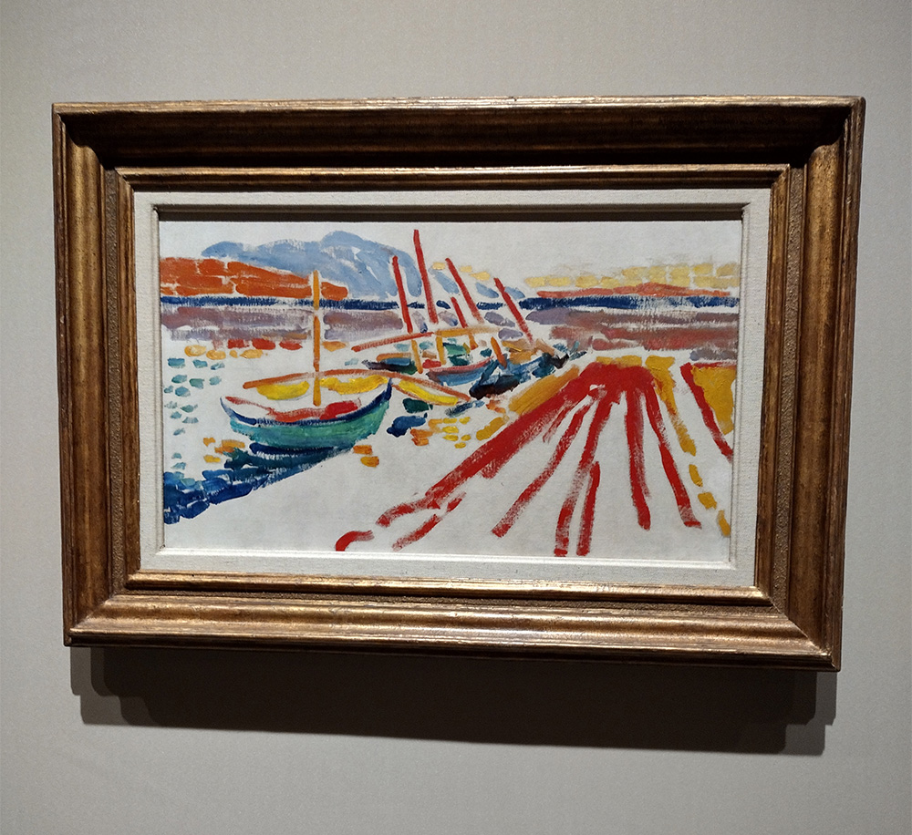
André Derain, Fishing Boats, Collioure, 1906. Picture by Coco Lin
One could easily imagine how much light bouncing from the water into the human eye is profound and particularly fascinating to those who did not grow up in this or similar environments. The curation was easy to follow as a viewer starting off with Derain’s works, which most or all were oil paintings; then there was a wall that bridged and transitioned between the two artists of portraits they painted of each other, followed by Matisse’s watercolors, oil paintings, and later drawings.
However, I have a few quarrels, however, about the way the works were curated on the walls, such as Derain’s paintings. The curation ruins the flow of the boat images when I want to look at every artwork on one side of the wall. I have to loop around to view the parallel wall. I understand that the curators may have wanted to align the works at eye level individually but would it have been better to play not only with different sizes alongside each other but also in clusters of similar scenes, subject matter, or the time of the day?
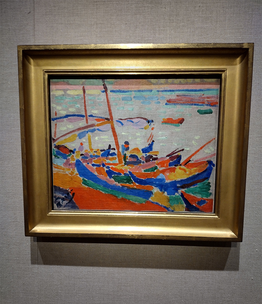
André Derain, The Pier at L’Estaque, 1906. Picture by Coco Lin
The other thing that bothered me was having one section of Derain’s and the rest of Matisse’s. It felt unbalanced when the press release mentioned how the artists were in partnership. It did not feel like a constant dialogue of exchange between the two artists and their works. The curators wanted to show some of Matisse’s watercolors and pencil drawings that he made. However, perhaps there were also pencil drawings made by Derain at this particular time.
It would have been interesting to see the underlying principles of how he approached composition, perspective and mark making. This would have also translated the way he held or moved his brush.
After a few days of viewing the exhibition, I was still struck by the pair of portraits that the artists painted each other. Matisse’s portrait shows Derain from mid chest upwards, with a tilted head and gaze towards his left. Perhaps a beret is what the red blob looks like. Despite the fact that I cannot imagine this pose being comfortable to model for a long time, the gesture appears like a moment caught in time, as if Derain was stretching or reacting to something unimpressed.
In this painting, Matisse had already started to use dark green or blues that artists in the 19th century would have used black, deep browns, or gray. His palette of reds, yellows, pinks, and purples are in pastel. Derain’s painting shows Matisse looking more straightforward with a smoke pipe. The tip of his head is cropped off by the frame.
Derain’s use of an ochre yellow base makes the saturated colors seem even brighter and warmer. Further, even though the larger areas of dark greens and blacks are not very detailed, this helps the viewer to see the dandelion yellows and reds of Matisse’s left hand side when they are looking at his left side. The quick impressions of thick brush strokes, letting the surface of the work to be seen and not fully covering continues in both artists’ works.
However, one could argue that Derain’s use of color resembles the sunrise and sunset of Collioure’s and Matisse’s resembles the high sun at noon that makes everything bright white.
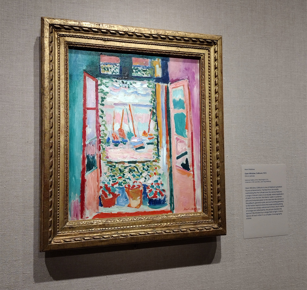
Henri Matisse, Open Window, Collioure, 1905. Picture by Coco Lin
The Derain’s works I like are the ones on the right wall at the start of the exhibition. I particularly like the two larger ones with the sailboats on them. It was interesting to see how much of the cream white was left by the artists but then he also used a bluish white to paint the sails.
It almost seems too modern to use the different whites in the same image. I also like the replacement of black with blues, especially navy and Prussian blues.
The strokes created by a square brush allow the images to feel unified even though the colors are not solid shapes. This is like ripples of light and reflections in water.
It was interesting to see the use of pastel colors in Matisse’s painting of the interior and exterior outside the window – a similar gravitational pull to Derain’s. Also I really appreciate seeing the sketches or works that led up to the Bonheur de Vivre.
I really like the way Matisse used yellows, oranges, blues, and pinks that continues to translate to his later works and later fauvist works that create images or objects through the simplification of shapes in combination with unexpected color combinations and relationships.
Overall the exhibition was a very enjoyable experience and I feel inspired to draw quick sketches inspired by Matisse, Derain, and the light of Collioure.
Coco Lin can be reached at coco.lin19@myhunter.cuny.edu